Which colour temperature?

Choosing the right colour temperature for your room is vitally important, but it is a matter of personal taste. This article serves as a comprehensive guide to understanding color temperatures and their impact on ambiance, helping you make an informed decision. We can only show you the door, you must be the one who walks through it.
For many years before LED lighting technology became mainstream, nobody was given a choice of which colour temperature to choose. You just bought a light bulb and without knowing or caring, you got extra warm white, with a colour temperature of 2700K to 2800K. As soon as LEDs came onto the scene, they were immediately available in warm white 3000K and cool white 4000K. This gave consumers the dilemma of which colour temperature to choose?
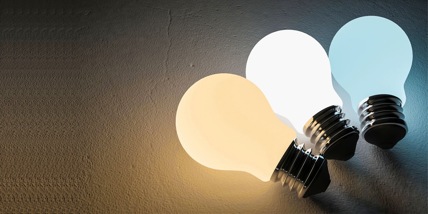
Colour temperatures are measured in Kelvin (K), which is symbolized by the letter K. The kelvin scale is used to measure color temperatures, representing the hue of a specific type of light source. The higher the Kelvin rating, the whiter and then bluer the light appears. Our colour temperature chart shown below, shows the scale of colour temperatures ranging from candlelight at 1800K to a clear blue sky at 8,000K to 12,000K.

Contrary to popular belief a higher colour temperature is not a measurement of brightness but appearance, brightness is measured in lumens. Because LEDs are blue to begin with, more phosphor is coated over the LED to provide the warmer colour temperatures; which does make the cooler colours appear slightly brighter. Generally cool white is around 5% brighter than warm white in terms of lumens.
Here are the main three colour temperatures used in modern day LED lights such as retrofit LED light bulb lamps and downlights:
-
Extra warm white 2700K - Similar to a traditional incandescent light bulb or halogen. A 2700K LED will still appear slightly whiter than a halogen but is more orange in appearance than the other colour temperatures. This is sometimes called ‘soft white’ by people in the trade. Extra warm white is not always an option with some brands of integrated LED downlights, so if you know you want this colour temperature you can narrow down your search to just a few options. If you like the cosier setting for your living room, this option can be taken a level further with DimTone dimming. DimTone reduces the colour temperature as its dimmed in brightness, mimicking the effects of a halogen and creating a more ambient, relaxing vibe. When comparing 2700k 3000k, 2700k and 3000k are both popular choices for residential spaces, but 2700K offers a warmer, more inviting ambiance, while 3000K is slightly cooler and crisper, making it suitable for both homes and commercial environments.
-
Warm white 3000K - Clearer in appearance but still quite warm. This has become the ‘new norm’ for general lighting and is by far the most popular choice that we sell. Not too warm and not too cold. These two color temperatures, 2700K and 3000K, are often chosen for their warmth, which creates a comfortable and welcoming atmosphere in living rooms, bedrooms, and hospitality settings.
-
Cool white 4000K - A much clearer and whiter appearance that is predominantly used in commercial locations like super markets and offices. Cool white appears brighter than warm white meaning it’s also more energy efficient. It can make a room feel cold and clinical but when used in the right environment it can make a room appear more modern and cleaner. This is also referred to as neutral white or cold white but as long as the Kelvin rating is the same then it can be called whatever you like. This is a popular option for kitchens and bathrooms. If you want a relaxing bath, can you really relax with cool white?
-
Daylight 5000K-6500K - This goes a step beyond cool white, adding more of a blue tinge to the environment. Too harsh for some, but adored by others.
When comparing colour temperatures, you won’t be able to fully appreciate the dramatic difference that each tone offers until a room is fully illuminated with one of them. Just testing a sample will give you an idea of the difference but until you’ve seen a room fully lit in one of the colours, only then will you truly understand the difference.
Each option also accents the colours of your walls, floor and surrounding area. If your kitchen has grey walls and cupboards, the cool white version could make your room appear too clinical like a doctors surgery. Compared to 3000K which makes less of a statement.
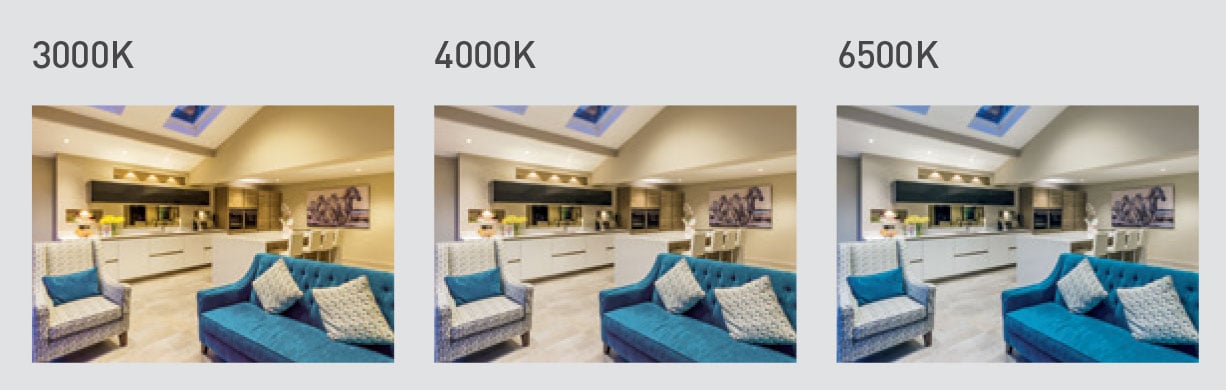
The images below show the impact that can colour temperatures can have in the same kitchen:


As you can see from the images above, choosing the right colour temperature and light color has a major impact on a room, which is why we advise seeking counseling. The colour of the walls, floors, cupboards etc should also be considered during your decision making process. The right colour temperature will emphasize the colours of the environment and bring the room to life, helping you achieve the desired atmosphere. For example an orange/yellow room may be more suited to extra warm white, whilst a blue or white room may be more suited to cool white. Light can bring your room to life and make it feel bright and vibrant.
Different color temperatures, especially warm light, contribute to a cozy and inviting environment, making your space feel comfortable and welcoming.
More Examples of Different Colour Temperatures
Here are some examples detailing which colour temperatures may work better in different room types:
Extra Warm White 2700K
Lounges, living rooms, bedrooms and bathrooms. This style of light appears warmer and sets a more relaxing, homely scene, making it ideal for bedrooms bathrooms where a relaxing atmosphere is desired. 2700K lighting features warmer tones that help create a cozy and inviting environment. If you like halogen, this is for you, but if you think halogen is too warm and want something clearer then try 3000K instead.
Warm White 3000K
Kitchens, conservatories and bathrooms. The slightly whiter appearance allows you to see better but is not too cold. 3000K provides a neutral light suitable for daily activities like cooking or working, offering a balanced, natural appearance. Although this colour temperature can be used anywhere.
Cool White 4000K
Although I wouldn’t recommend this in lounges, cool white can be used effectively in kitchens. The most popular destination for this colour temperature is bathrooms. In a white bathroom it can make the area appear brighter and cleaner although if your planning on spending time in the bath it you may want to go for a more warmer appearance. Cool white 4000K is also suitable for outdoor settings and outdoor spaces, where its brightness can enhance visibility and accentuate architectural features.
Dim Tone / Dim to Warm
Some LEDs will change colour temperature as they get dimmed down lower. Starting at full brightness at a regular 2800K or 2700K warm white colour temperature, as they get dimmed they start appearing more warmer. The lower the brightness becomes the warmer they become, until they reach a colour temperature of 1800K to 2200K which is similar to a candlelight effect. This can be used effectively in bathrooms to set a relaxing low lux lighting effect that appears just like a candle. They can also be used in bars and restaurants to create a more relaxing or romantic setting at night times.
The Philips 4.9W GU10 LED features this technology and our Sunset LED strip tape too, which goes from 3000K down to 1800K.
Colour Temperature Switchable Lighting
If you really can’t decide, even after years of counseling, you don’t always have to. Colour temperature switchable lighting contains multiple colour temperatures in one. The JCC V50 downlight for example is fitted with a small dip switch located under the bezel. Switching this allows you to select warm white 3000K or cool white 4000K whenever you like.
Or taking this a step further with the Centorio from Ricoman which is colour temperature adjustable with a remote control or wall switch. This particular downlight has 3000K, 4000K and 5000K in one, providing even more flexibility. Lighting in the 5000K-5700K range mimics daylight, which enhances visibility and reduces glare, making it ideal for security and task-oriented areas. Additionally, 6500K is considered natural light and is suitable for environments requiring detailed tasks, such as laboratories and operating rooms.
Smart lighting provides you with even more flexibility, with some LEDs options that also include colour changing and CCT (Correlated Colour Temperature) adjusting in one light bulb. This allows you to unlock the full colour spectrum of light whenever you light. This really shows how far LED light has come and how much its surpassed incandescent.
This video made by Aurora Lighting explains some of the science behind choosing the right colour temperature:
Summary
There’s no right or wrong answer, it’s your room and your choice. Consider what the main activities and what the main function of the room will be. Some people have different colour temperatures in each room, but you can get a contrast as you go from one to another. If in doubt feel free to order samples from us on a sale or return basis, simply return the ones you don’t like.
Colour Temperature and Eye Strain
When it comes to creating a comfortable and inviting atmosphere in your home, colour temperature isn’t just about aesthetics—it also plays a crucial role in reducing eye strain. The type of light you choose can make a significant difference in how your eyes feel, especially after long periods spent in a room.
Warm white light, typically in the 2700K to 3000K range, is often the go-to choice for living rooms, dining areas, and bedrooms. This softer glow and neutral tone help promote relaxation and are much gentler on the eyes compared to the harsher, brighter white light of higher Kelvin ratings. If you’re looking to create a cozy atmosphere that encourages unwinding at the end of the day, warm white light bulbs are your best friend. They provide just the right colour temperature to minimize eye strain and foster a pleasant atmosphere.
On the other hand, cool white light—think 4000K and above—delivers a brighter, more intense light that mimics natural daylight. While this can be ideal for outdoor lighting, detailed work, or spaces where full brightness is needed, it can sometimes lead to eye strain if used in relaxation areas or for extended periods. That’s why it’s important to match the light source to the function of the room. For example, a higher Kelvin rating is suitable for kitchens, home offices, or outdoor areas where clarity and focus are key, but it might feel too stark in a bedroom or lounge.
A great way to create a balanced and visually comfortable environment is to use different colour temperatures throughout your home. For instance, opt for warm white in relaxation areas and switch to neutral or cool white in spaces where you need to concentrate or see details clearly. This approach not only helps reduce eye strain but also enhances the overall atmosphere and functionality of each room.
Another factor to consider is the Colour Rendering Index (CRI) of your light sources. High CRI lighting ensures that colours appear true and vibrant, which can further reduce eye strain caused by poor colour rendering. When shopping for LED lights, look for options with a high CRI and the right colour temperature for your needs.
Ultimately, finding the right balance of colour temperature, brightness, and CRI is key to creating a space that’s both comfortable and visually appealing. Whether you’re aiming for a relaxing retreat in your living room or a bright, focused environment for outdoor activities, choosing the right colour temperature can make all the difference in reducing eye strain and enhancing your home’s atmosphere.